Greatness Ad Explored

Introduction

Nike is a worldwide recognized sporting goods and athletic company. They are known for their professional and consumer products, associations with professional and amateur athletes, and inspirational & motivative advertisements.

This particular Nike ad was part of their “Find Your Greatness” ad campaign. This particular print ad was based on a television commercial that featured the titular runner and mountainous background.

Video Ad: https://vimeo.com/46783054
Print Ad: https://www.tes.com/lessons/oNUbIIuShuUdRA/finding-your-greatness

Original Ad
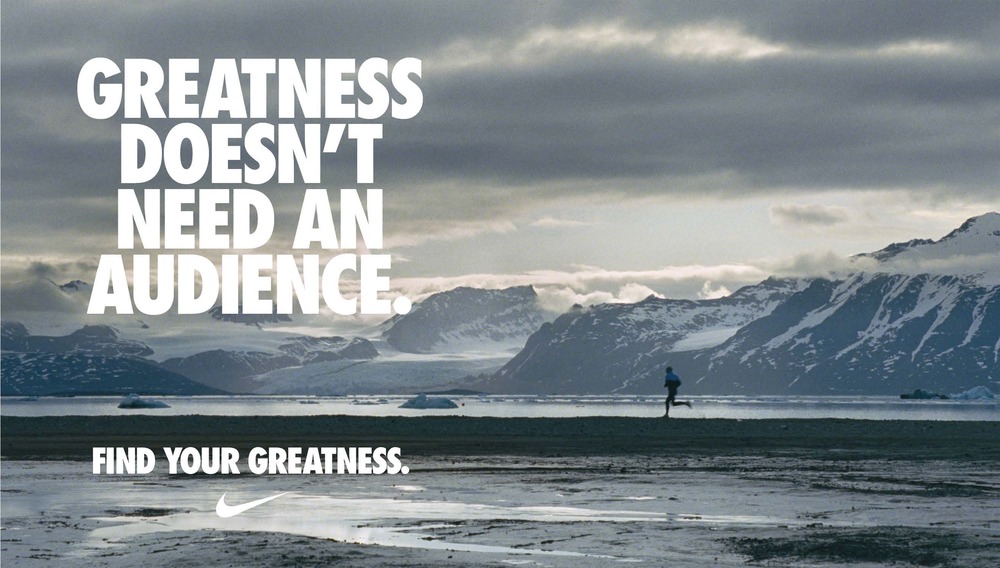
“Find Your Greatness” Runner ad by Nike

New Ad

Created Ad for Assignment

Analyzing the original Ad

Design: Alignment
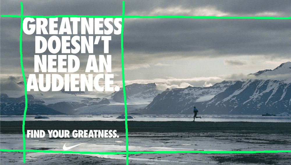
Left alignment is created by positioning all text on the left side of the image. By keeping all text within the chosen region, the image has an opportunity to show its depth and also balance the subjects of the ad.

Design: Contrast
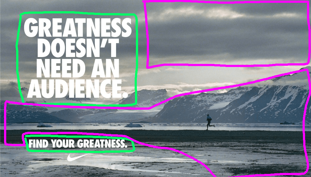
Contrast is created with the use of a dark background with white lettering. Also, by using an almost “black & white” image, an image that minimizes its use of color, a sense of contrast can more easily be created with the lettering while also maintaining the chosen theme and tone of the ad.

Design: Proximity
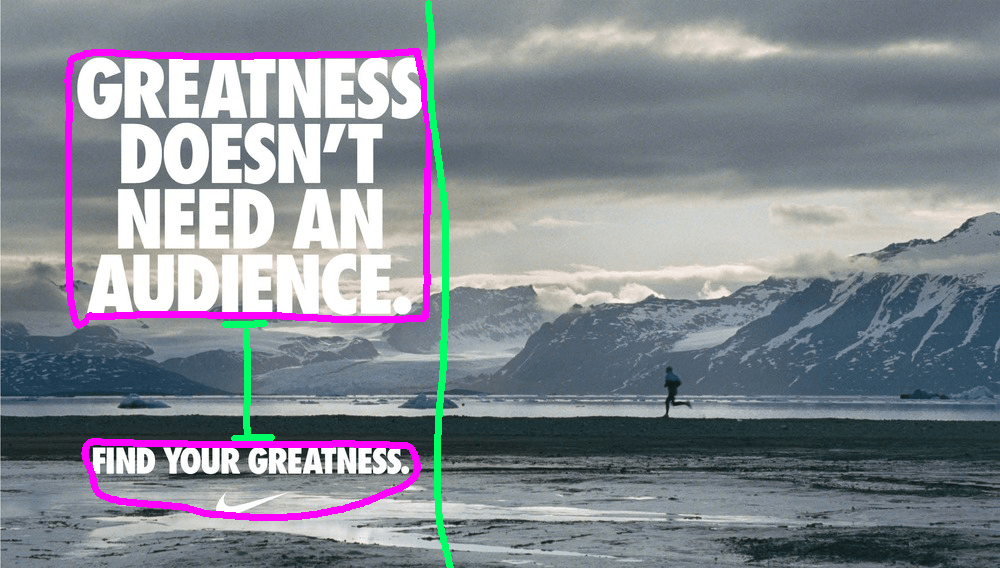
The main copy is grouped tightly together and used big font size to call attention to the main idea of the ad. It’s also grouped to one side of the ad to show the depth of the image. The tagline is grouped within the same width of the main copy but also given enough space to make it its own idea. The tagline is also grouped with the Nike logo to create an association with the company and greatness.

Design: Repetition
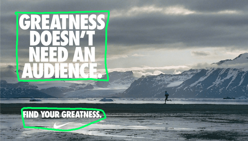
Repetition is created by using the same font type and color. The Nike logo also has the same color and is not exceed the size of the tagline font size. This font color also helps match the white in the ad’s image.

Color & Typography

The color theme of the ad uses a stark contrast of light and dark. There’s not too much color to the ad, mostly white, gray, dark blues, and black. This works for the ad as it helps bring out the snow and create a sense of isolation in the image.
The typography that Nike uses is Futura Condensed Extra Black.

Analyzing the new Ad

Design: Alignment
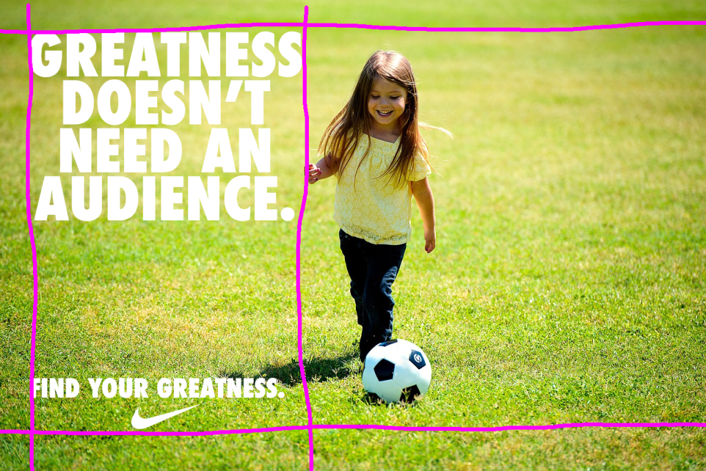
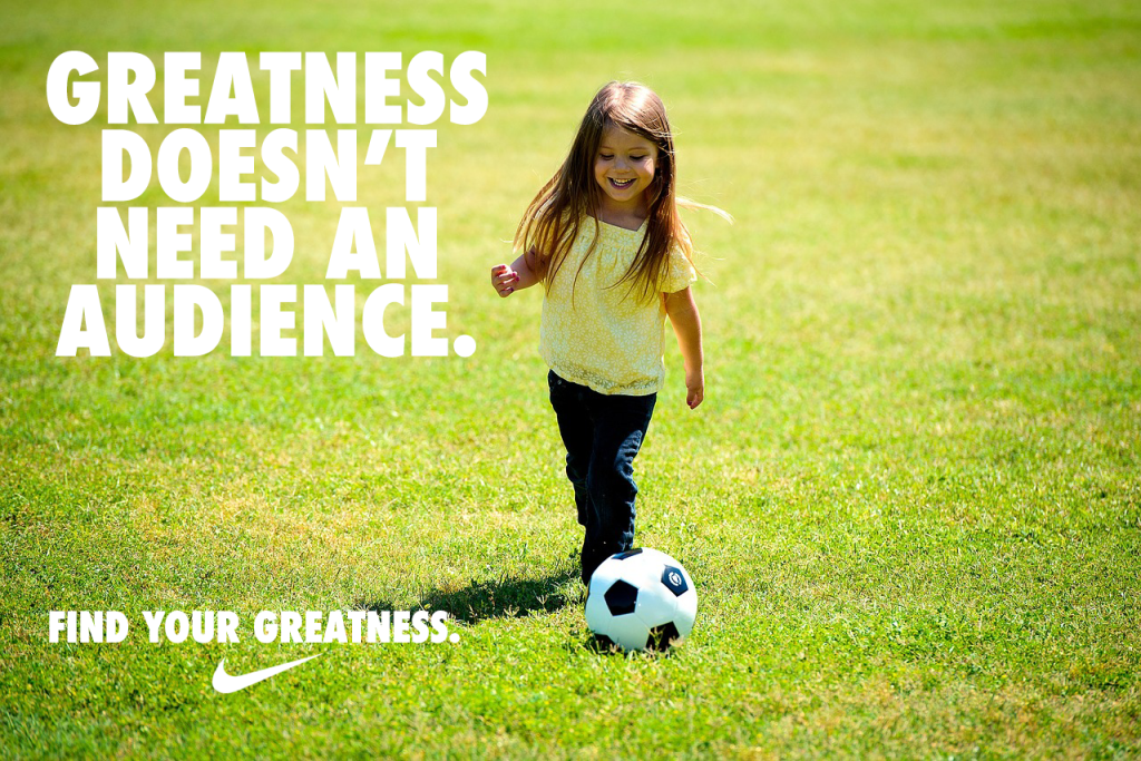
Alignment for the new ad is similar to the original ad. Use of a left alignment is used. The body copy and the tagline are more aligned than on the original. The original seems to be a bit more centered with the text. The Nike logo is still centered with the tagline.

Design: Contrast
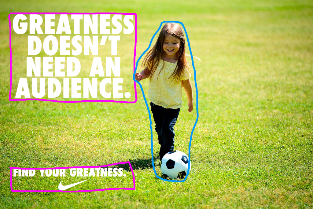
Contrast shows between the text and the background. The green of the background is dark enough to contrast with the white text and Nike logo. The image of the girl also adds some difference with the background. Compared with the original ad, the subject is more noticeable, whereas on the original ad the runner was silhouetted and is more able to blend in with the darks of the image.
There is also some contrast in the girl’s head & hair, pants, and soccer ball. With this being darker than the surrounding grass, the eye is drawn to the girl.

Design: Proximity
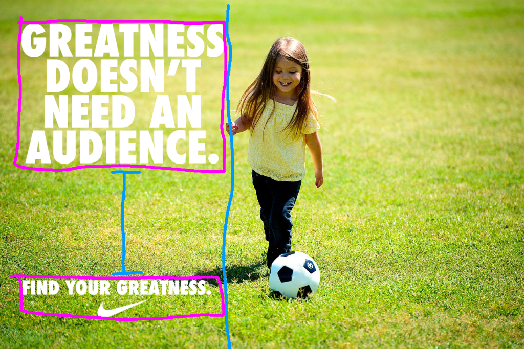
The main copy and the tagline are grouped into their own portions on the ad, similar to the original. With the new ad, an image was sought that had the subject more centered and pronounced. By having the girl closer to the text, this helps associate her with the word “Greatness” more strongly.

Design: Repetition
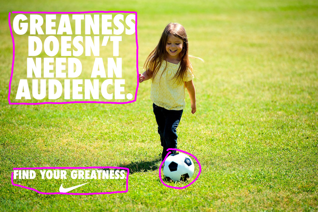
Repetition shows between the text and the Nike logo, just like the original ad, but there is further repetition with the soccer ball. This white element also helps associate the soccer ball, or rather part of the image, with the text.

Color & Typography

The color with this new ad is more bright and exciting, compared with the original ad’s more somber and isolated tone. The green of the grass and the yellow of the girl’s shirt help contribute to the lightness.
The typography used is the same as the original: Futura Condensed Extra Black.

Conclusion

The new ad uses a lot of the same elements as the original ad so they have similar looks and feels. The new ad fits in with the campaign of the original ad by taking that same message of inspiration and shifting it from an external feel to an internal one.

Where the original ad sells the idea that the runner finds greatness through hard work due mostly to their athletic ability and determination, the new ad focus more on the potential that is within a child. While the child might not have the same athletic ability as the runner, they have greatness in the opportunities that lie ahead in their life.

This motivative message is the same in both, greatness is found within. It is up to us discover the greatness that lies inside.
Putting Into Perspective

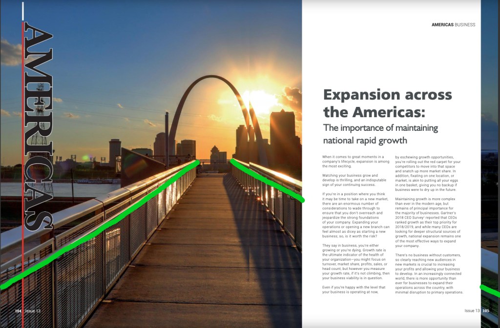
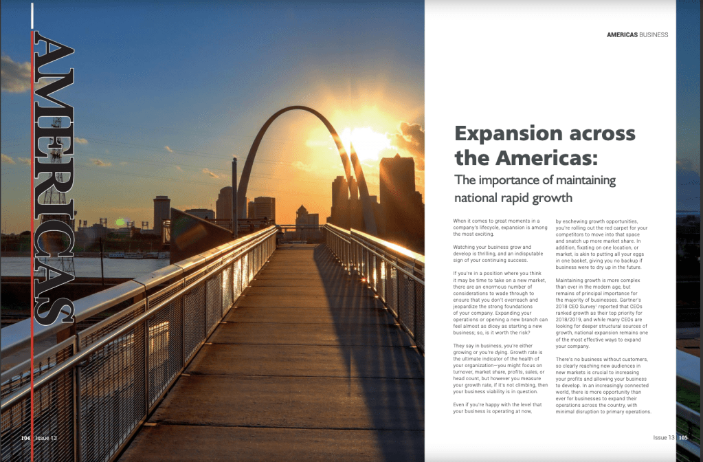
1-point perspective use of leading lines and depth.
From magazine: Global Banking and Finance Review Magazine. Issue 13, Oct 25, 2018

Link: https://issuu.com/globalbankingandfinancereview/docs/forissuu_b12f961e08929d

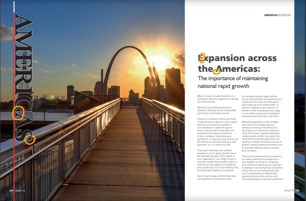
The image used is from the Global Banking and Finance Review Magazine. There was no credited photographer for this image. The magazine is centered on business information and guidance. The publishing company is based in London, UK.

The design of the image uses a 1-point perspective with leading lines and depth elements. The article is about ideas and strategies to consider if one is to grow their business. The image used shows a walkway leading into the horizon, toward the St. Louis Gateway Arch. This plays very well with the content of the article and the use of leading lines to draw the eye toward the Gateway Arch. There is also an element of Depth as the foreground is the walkway and in the background is the Arch and the city’s skyline.

Typeface Recognition

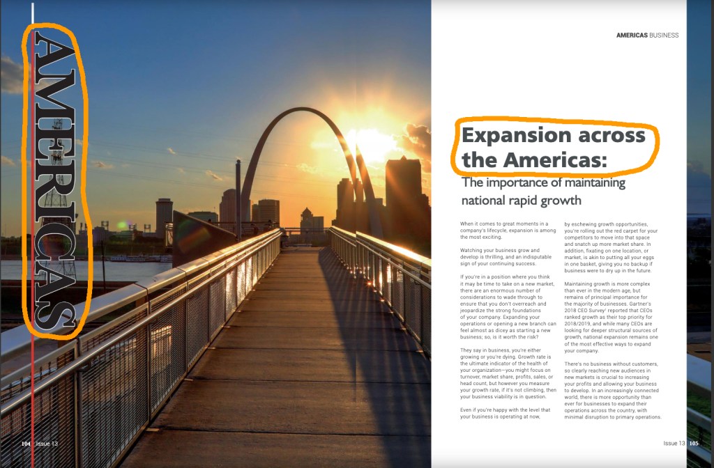
The 2 different typefaces used for this article include Slab Serif and Sans Serif. The differences are easily identified as the Slab Serif has thick horizontal slabs, vertical stress, and slight contrast in the stroke. The Sans Serif has no serifs, no stroke transition, and no visible stress.

Comparing Fonts

The 2 fonts used are quickly distinguished by the serifs they respectively use or not use, as described in the previous section. This shows the contrast in Structure. The size also differ to add opposition. The Slab Serif “Americas” is so much greater than the rest of the Sans Serif text used. The obvious use of differing Directions also adds great opposition in the text, as the Slab Serif is perpendicular to the page. As for the forms used, the Slab Serif font uses all CAPS, and the Sans Serif uses lower case.

Image Elements

Briefly mentioned in the first section is the use of leading lines and depth by the designer. Leading lines draw the eyes in and guide the viewer toward the St. Louis Gateway Arch. With this, the point of intersection seems to be the center of the page. While the Rule of Thirds might not be strictly used in this instance, the centering of the perspective point gives the image a balance. The top portion is mostly negative space, but also contains the background elements. The bottom portion of the image contains the foreground images, which creates the depth of field. The images has a sort of balance by allowing the horizon to be centered, rather than on one of the Rule of Third’s horizontal lines.

3 Friendly Images

The 3 images that I took contain the same use of the 1-point perspective and use of depth of field. As the image used in the official publication sought to create a sense of direction, movement, and progress, the 3 images I took also contain leading lines that draw the eye toward the horizon, and give the sense of progress and movement. Each image contains a road or walkway, objects that are associated with motion and direction. There also contains an element of depth of field as the foreground is clear and distinct, and the background becomes a bit less clear the further away the images goes from the viewer. Any of these images could be substituted and the same sense of movement and progress would be conveyed.

Conclusion

Using an image of movement and progress, and the contrasting typeface, these elements support the content of the article and the overall magazine’s intent: offering helpful information and guidance for progress and growth in business in America. As this is an overseas publication, the use of an image of an American city helps to give the target reader a sense that this information is for them. The image conveys progression and reaching one’s goals. Contrasting the font also aids in targeting an American viewer or those who have business in the Americas. The overall design supports the content of the article.

Apple Ad in Reverse

Introduction

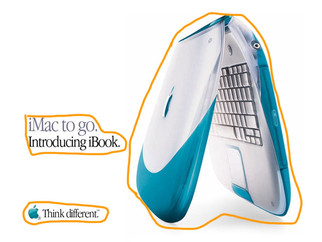
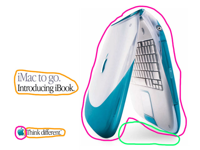
Apple has arguably one of the most recognizable styles in the world, whether it be their products or their ad campaigns. In recent years, they have heavily relied on a clean, sometimes minimalist, but always consistent style. Their aesthetic is instantly identifiable. They stand apart from all their competitors.

This image was found: here

Contrast

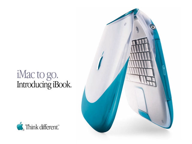
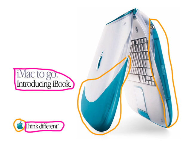
Contrast is instantly created by using a white background. Using black and gray font along with a large image and a simple colored logo are immediately grouped among all the white space. Contrast is also created between the different sizes of the image, the main copy, and the logo and tagline. Within the main copy, use of gray and black font creates a contrast that compares the iBook with the iMac.

Repetition

Color and font are the main components in creating repetition in this particular ad. The teal color between the iBook image and the Apple logo creates the quickest instance of repeating elements. The style of font is also repeated throughout the ad. Along with font style is the use of black font in the main copy and the tagline. There is also repetition when using the proper names of the computers: iMac and iBook, as both begin with the lower case “i” immediately followed by a capitalized “M” and “B” respectively

Proximity

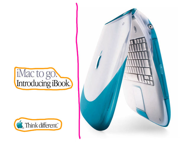
All the text is set on the left side of the ad. There are 3 groups of elements in this ad: the image of the iBook, the corporate logo and tagline, and the main copy. The text is grouped together so that it conveys similar information together. This helps organize the ad in a simple way that makes it quick and easy for the viewer to understand.

Alignment

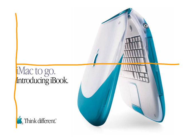
All the text is aligned along the left edge of the ad. Due to the main copy being short and middle aligned with the image, not above or set more toward the upper left corner, this allows the eye to transfer from the main copy to the iBook image. As the last word read is ‘iBook” then the image follows, this associates the title with the iBook.

Color

White is the dominate color in this ad. This creates the cleanliness of the ad, implying purity. As the text and images are minimal, anything not white easily stands out. The teal color shared by the iBook and the Apple logo creates an association. In the main copy, gray and black font help give you the sense of two separate but related ideas. Starting with the gray allows the emphasis to be placed on the iBooks introduction. A subtile piece of coloring is the shadowing under the iBook. The font is flat as its presented on the same plane, but this shadow adds a bit of depth, a sense of a 3rd dimension.

Conclusion

All these elements combine to present a minimal ad that leaves a big impact. The chosen colors aid in making as much of an impact within its limited components. This ad accomplishes a couple tasks: it introduces a new produce, associates that new product with another well known product, and carries on the style trend that would establish Apple as a recognizable brand.