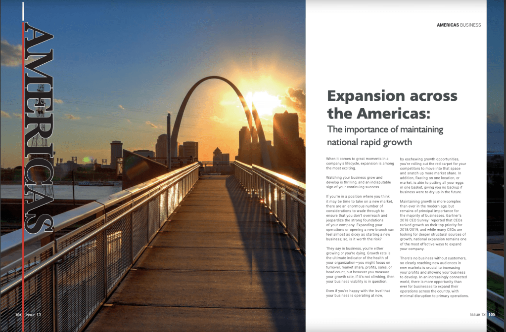
From magazine: Global Banking and Finance Review Magazine. Issue 13, Oct 25, 2018
Link: https://issuu.com/globalbankingandfinancereview/docs/forissuu_b12f961e08929d
The image used is from the Global Banking and Finance Review Magazine. There was no credited photographer for this image. The magazine is centered on business information and guidance. The publishing company is based in London, UK.
The design of the image uses a 1-point perspective with leading lines and depth elements. The article is about ideas and strategies to consider if one is to grow their business. The image used shows a walkway leading into the horizon, toward the St. Louis Gateway Arch. This plays very well with the content of the article and the use of leading lines to draw the eye toward the Gateway Arch. There is also an element of Depth as the foreground is the walkway and in the background is the Arch and the city’s skyline.
Typeface Recognition
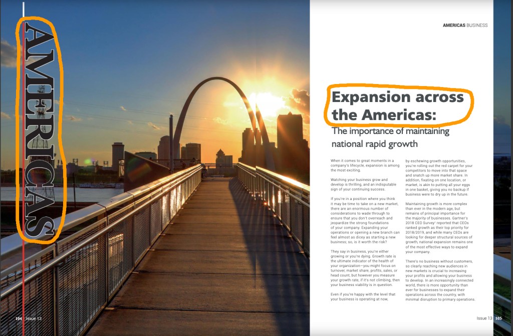
The 2 different typefaces used for this article include Slab Serif and Sans Serif. The differences are easily identified as the Slab Serif has thick horizontal slabs, vertical stress, and slight contrast in the stroke. The Sans Serif has no serifs, no stroke transition, and no visible stress.
Comparing Fonts
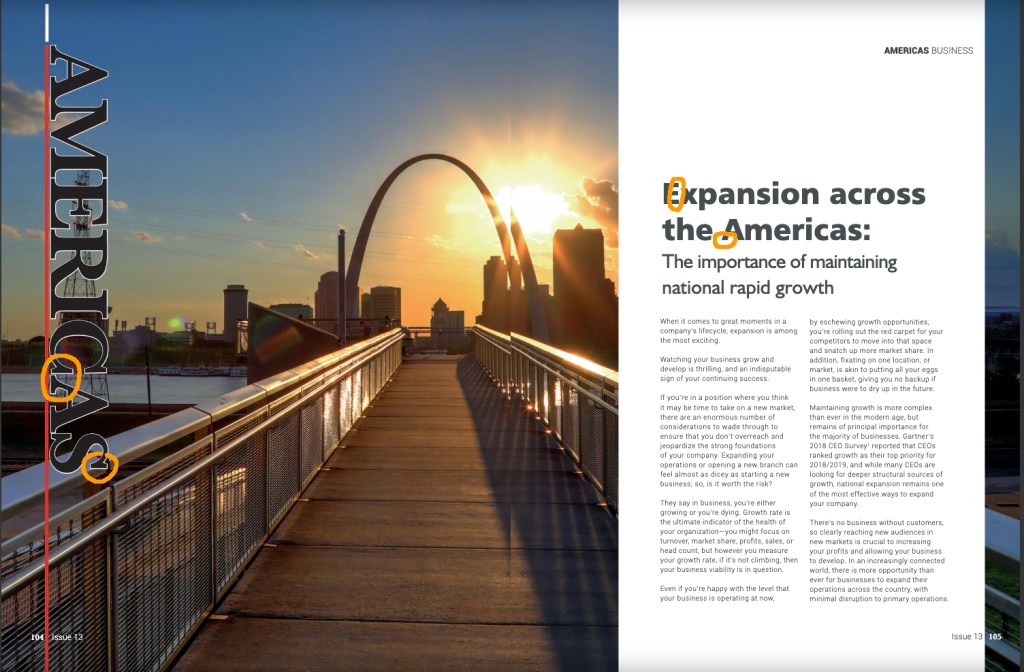
The 2 fonts used are quickly distinguished by the serifs they respectively use or not use, as described in the previous section. This shows the contrast in Structure. The size also differ to add opposition. The Slab Serif “Americas” is so much greater than the rest of the Sans Serif text used. The obvious use of differing Directions also adds great opposition in the text, as the Slab Serif is perpendicular to the page. As for the forms used, the Slab Serif font uses all CAPS, and the Sans Serif uses lower case.
Image Elements
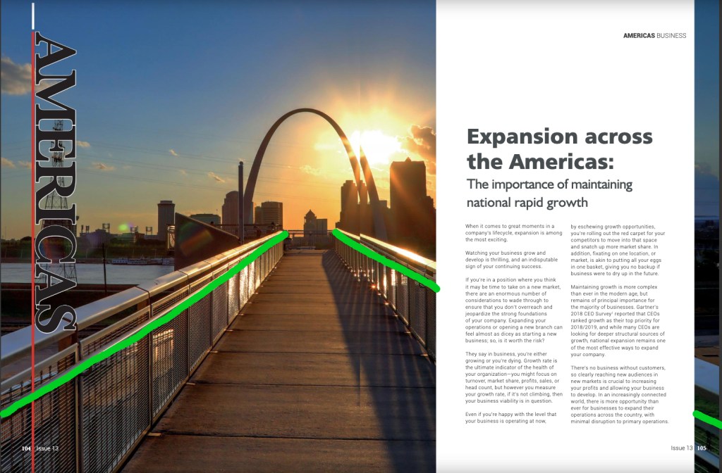
Briefly mentioned in the first section is the use of leading lines and depth by the designer. Leading lines draw the eyes in and guide the viewer toward the St. Louis Gateway Arch. With this, the point of intersection seems to be the center of the page. While the Rule of Thirds might not be strictly used in this instance, the centering of the perspective point gives the image a balance. The top portion is mostly negative space, but also contains the background elements. The bottom portion of the image contains the foreground images, which creates the depth of field. The images has a sort of balance by allowing the horizon to be centered, rather than on one of the Rule of Third’s horizontal lines.
3 Friendly Images
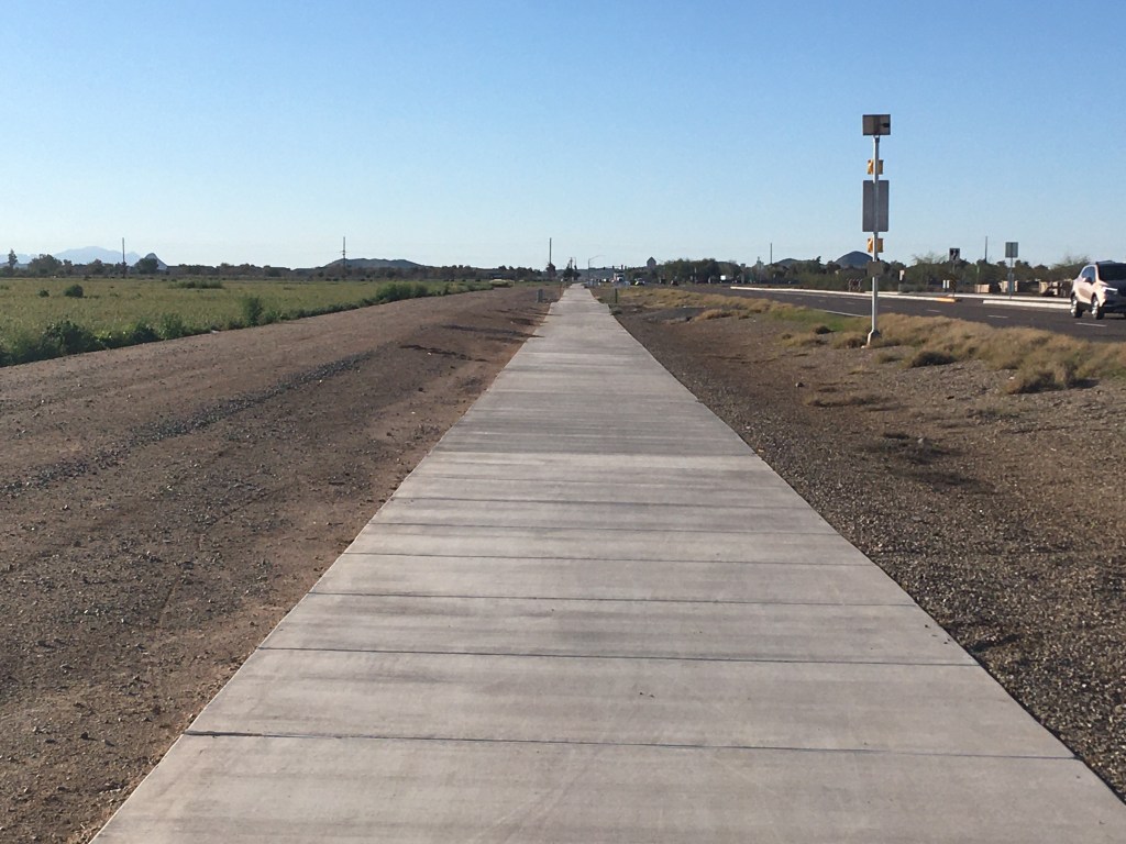
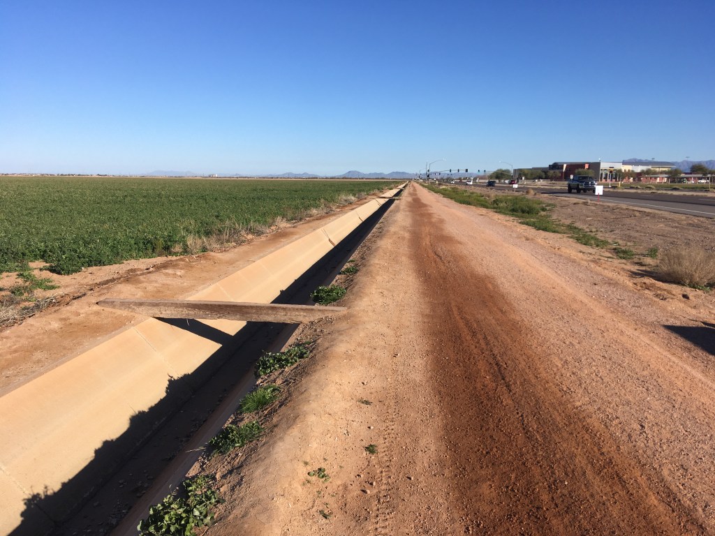
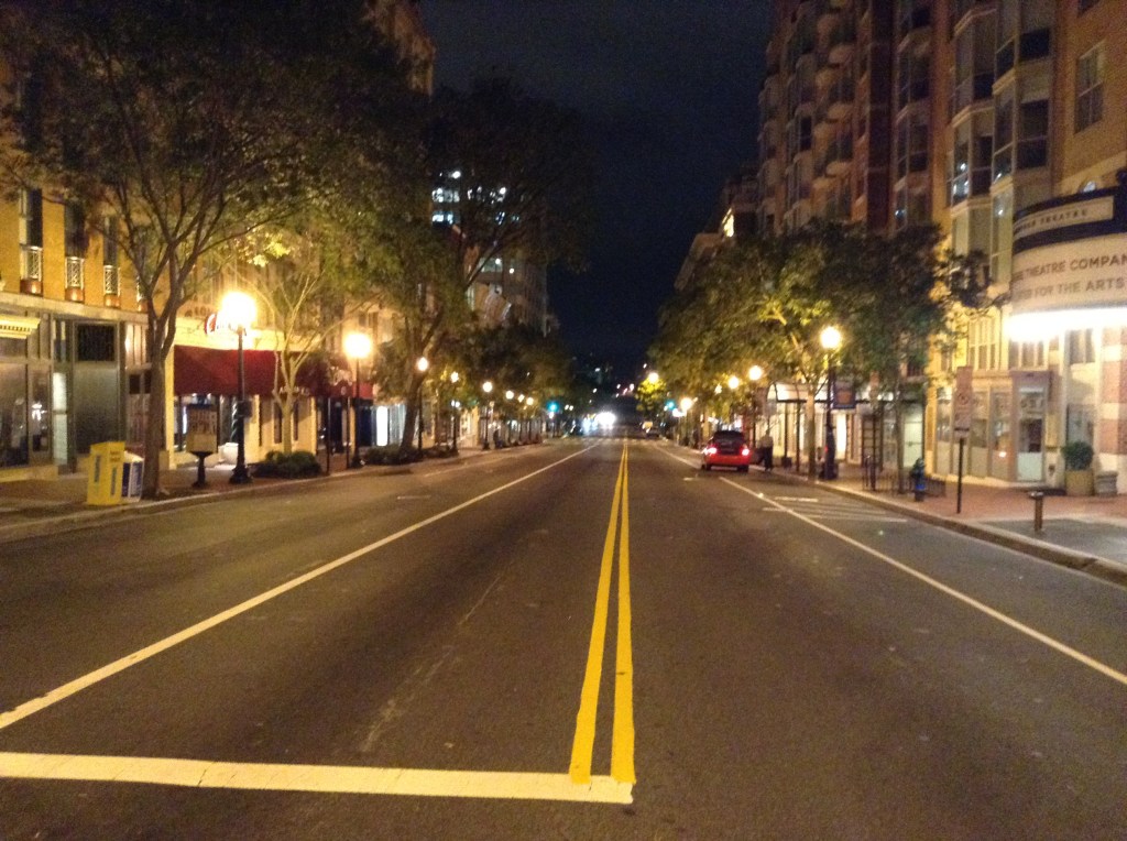
The 3 images that I took contain the same use of the 1-point perspective and use of depth of field. As the image used in the official publication sought to create a sense of direction, movement, and progress, the 3 images I took also contain leading lines that draw the eye toward the horizon, and give the sense of progress and movement. Each image contains a road or walkway, objects that are associated with motion and direction. There also contains an element of depth of field as the foreground is clear and distinct, and the background becomes a bit less clear the further away the images goes from the viewer. Any of these images could be substituted and the same sense of movement and progress would be conveyed.
Conclusion
Using an image of movement and progress, and the contrasting typeface, these elements support the content of the article and the overall magazine’s intent: offering helpful information and guidance for progress and growth in business in America. As this is an overseas publication, the use of an image of an American city helps to give the target reader a sense that this information is for them. The image conveys progression and reaching one’s goals. Contrasting the font also aids in targeting an American viewer or those who have business in the Americas. The overall design supports the content of the article.
 78raphael