Apple Ad in Reverse
Introduction
Apple has arguably one of the most recognizable styles in the world, whether it be their products or their ad campaigns. In recent years, they have heavily relied on a clean, sometimes minimalist, but always consistent style. Their aesthetic is instantly identifiable. They stand apart from all their competitors.
This image was found: here
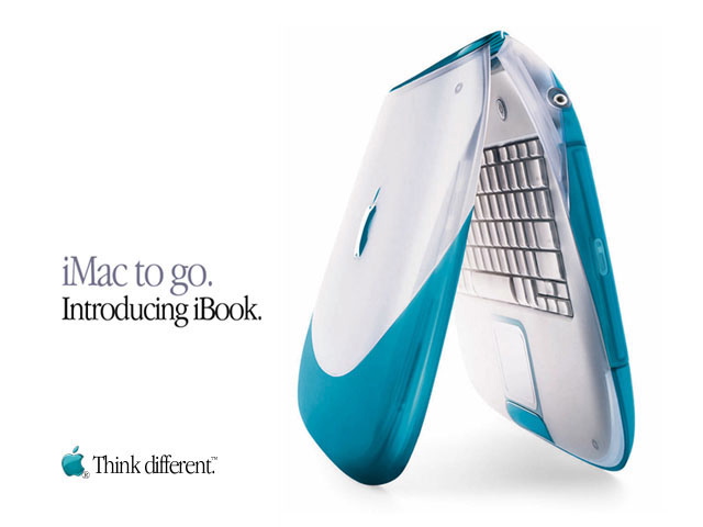
Contrast
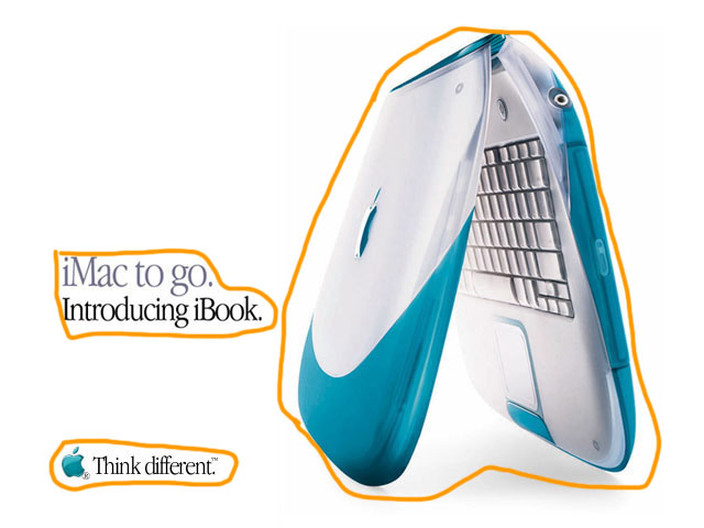
Contrast is instantly created by using a white background. Using black and gray font along with a large image and a simple colored logo are immediately grouped among all the white space. Contrast is also created between the different sizes of the image, the main copy, and the logo and tagline. Within the main copy, use of gray and black font creates a contrast that compares the iBook with the iMac.
Repetition
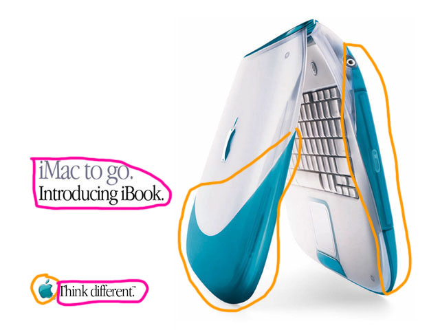
Color and font are the main components in creating repetition in this particular ad. The teal color between the iBook image and the Apple logo creates the quickest instance of repeating elements. The style of font is also repeated throughout the ad. Along with font style is the use of black font in the main copy and the tagline. There is also repetition when using the proper names of the computers: iMac and iBook, as both begin with the lower case “i” immediately followed by a capitalized “M” and “B” respectively
Proximity
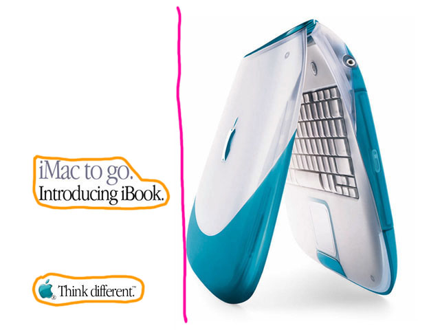
All the text is set on the left side of the ad. There are 3 groups of elements in this ad: the image of the iBook, the corporate logo and tagline, and the main copy. The text is grouped together so that it conveys similar information together. This helps organize the ad in a simple way that makes it quick and easy for the viewer to understand.
Alignment
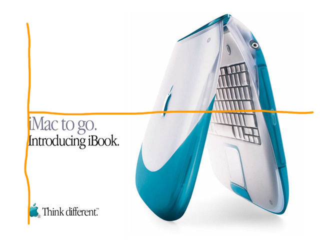
All the text is aligned along the left edge of the ad. Due to the main copy being short and middle aligned with the image, not above or set more toward the upper left corner, this allows the eye to transfer from the main copy to the iBook image. As the last word read is ‘iBook” then the image follows, this associates the title with the iBook.
Color
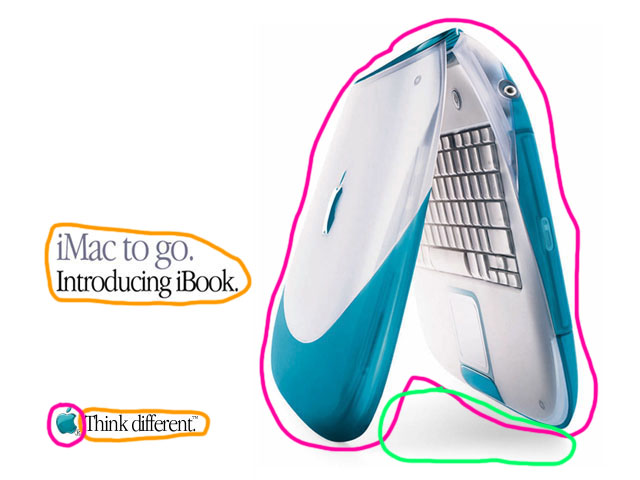
White is the dominate color in this ad. This creates the cleanliness of the ad, implying purity. As the text and images are minimal, anything not white easily stands out. The teal color shared by the iBook and the Apple logo creates an association. In the main copy, gray and black font help give you the sense of two separate but related ideas. Starting with the gray allows the emphasis to be placed on the iBooks introduction. A subtile piece of coloring is the shadowing under the iBook. The font is flat as its presented on the same plane, but this shadow adds a bit of depth, a sense of a 3rd dimension.
Conclusion
All these elements combine to present a minimal ad that leaves a big impact. The chosen colors aid in making as much of an impact within its limited components. This ad accomplishes a couple tasks: it introduces a new produce, associates that new product with another well known product, and carries on the style trend that would establish Apple as a recognizable brand.
 78raphael