Greatness Ad Explored
Introduction
Nike is a worldwide recognized sporting goods and athletic company. They are known for their professional and consumer products, associations with professional and amateur athletes, and inspirational & motivative advertisements.
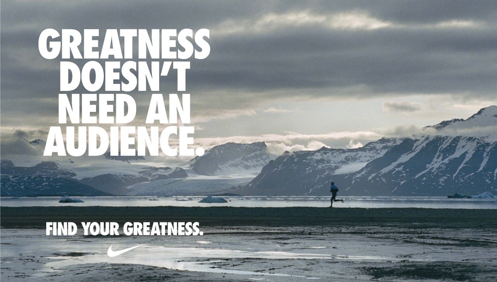
This particular Nike ad was part of their “Find Your Greatness” ad campaign. This particular print ad was based on a television commercial that featured the titular runner and mountainous background.
Video Ad: https://vimeo.com/46783054
Print Ad: https://www.tes.com/lessons/oNUbIIuShuUdRA/finding-your-greatness
Original Ad
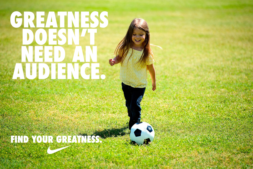
New Ad
Analyzing the original Ad
Design: Alignment
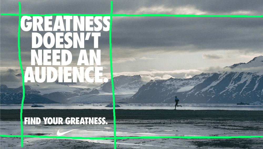
Left alignment is created by positioning all text on the left side of the image. By keeping all text within the chosen region, the image has an opportunity to show its depth and also balance the subjects of the ad.
Design: Contrast
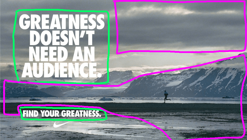
Contrast is created with the use of a dark background with white lettering. Also, by using an almost “black & white” image, an image that minimizes its use of color, a sense of contrast can more easily be created with the lettering while also maintaining the chosen theme and tone of the ad.
Design: Proximity
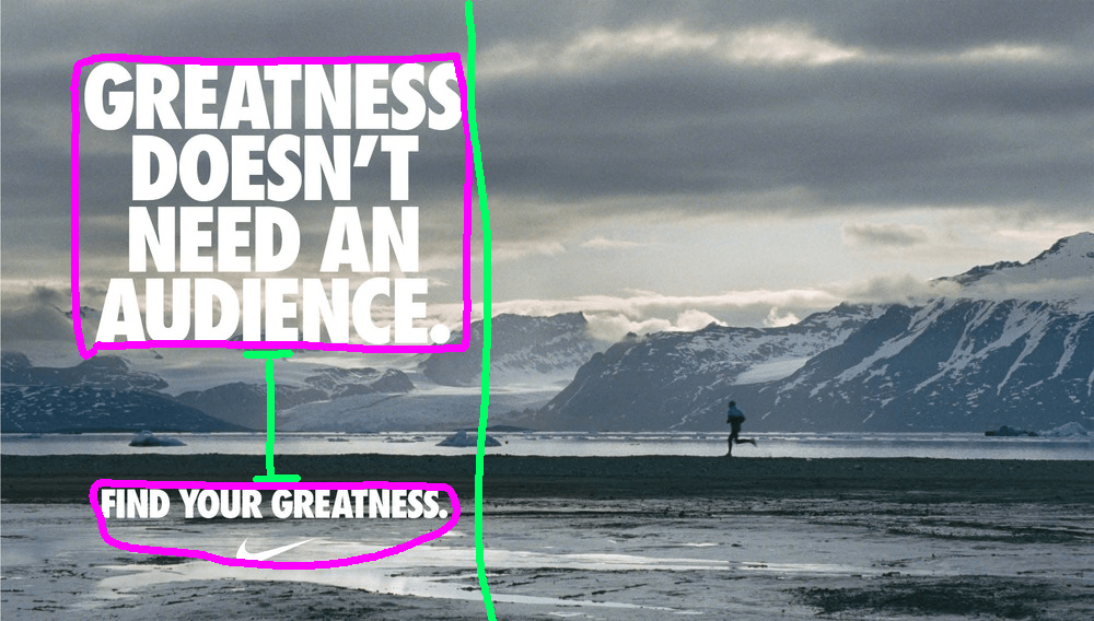
The main copy is grouped tightly together and used big font size to call attention to the main idea of the ad. It’s also grouped to one side of the ad to show the depth of the image. The tagline is grouped within the same width of the main copy but also given enough space to make it its own idea. The tagline is also grouped with the Nike logo to create an association with the company and greatness.
Design: Repetition

Repetition is created by using the same font type and color. The Nike logo also has the same color and is not exceed the size of the tagline font size. This font color also helps match the white in the ad’s image.
Color & Typography
The color theme of the ad uses a stark contrast of light and dark. There’s not too much color to the ad, mostly white, gray, dark blues, and black. This works for the ad as it helps bring out the snow and create a sense of isolation in the image.
The typography that Nike uses is Futura Condensed Extra Black.
Analyzing the new Ad
Design: Alignment
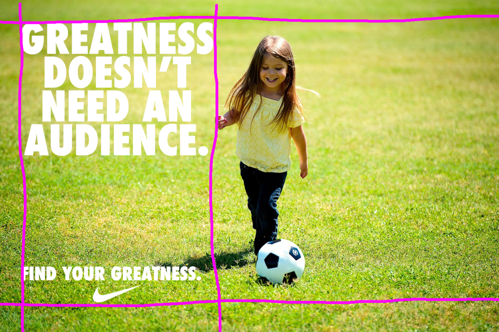
Alignment for the new ad is similar to the original ad. Use of a left alignment is used. The body copy and the tagline are more aligned than on the original. The original seems to be a bit more centered with the text. The Nike logo is still centered with the tagline.
Design: Contrast
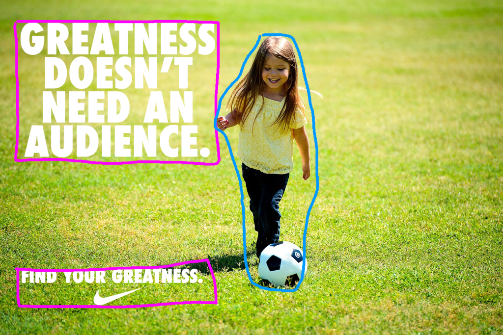
Contrast shows between the text and the background. The green of the background is dark enough to contrast with the white text and Nike logo. The image of the girl also adds some difference with the background. Compared with the original ad, the subject is more noticeable, whereas on the original ad the runner was silhouetted and is more able to blend in with the darks of the image.
There is also some contrast in the girl’s head & hair, pants, and soccer ball. With this being darker than the surrounding grass, the eye is drawn to the girl.
Design: Proximity
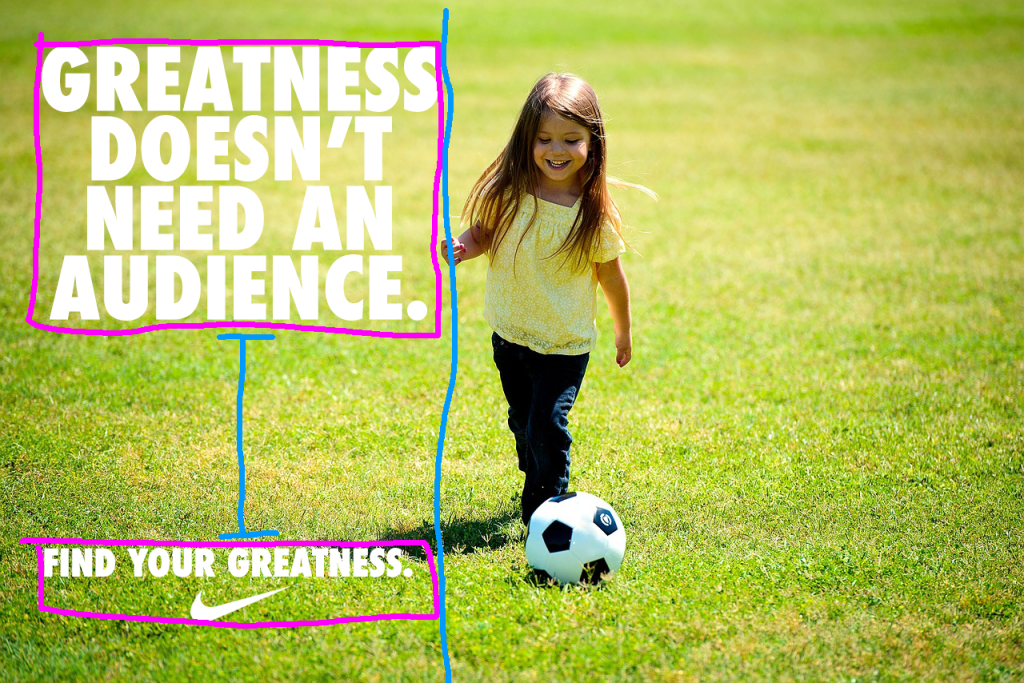
The main copy and the tagline are grouped into their own portions on the ad, similar to the original. With the new ad, an image was sought that had the subject more centered and pronounced. By having the girl closer to the text, this helps associate her with the word “Greatness” more strongly.
Design: Repetition
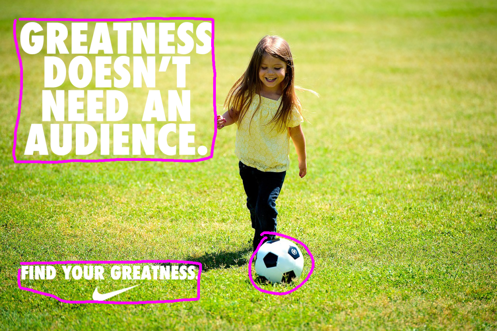
Repetition shows between the text and the Nike logo, just like the original ad, but there is further repetition with the soccer ball. This white element also helps associate the soccer ball, or rather part of the image, with the text.
Color & Typography
The color with this new ad is more bright and exciting, compared with the original ad’s more somber and isolated tone. The green of the grass and the yellow of the girl’s shirt help contribute to the lightness.
The typography used is the same as the original: Futura Condensed Extra Black.
Conclusion
The new ad uses a lot of the same elements as the original ad so they have similar looks and feels. The new ad fits in with the campaign of the original ad by taking that same message of inspiration and shifting it from an external feel to an internal one.
Where the original ad sells the idea that the runner finds greatness through hard work due mostly to their athletic ability and determination, the new ad focus more on the potential that is within a child. While the child might not have the same athletic ability as the runner, they have greatness in the opportunities that lie ahead in their life.
This motivative message is the same in both, greatness is found within. It is up to us discover the greatness that lies inside.
 78raphael